Posts Tagged ‘ ad ’

I really like cats

Posted on May 5th, 2010 2 Comments

Thanks to an astute twitterer for this gem.

kittens, ad, craigslist, toronto, city, life

Filed under: B Sides

Home of the frigid jerk

Posted on August 31st, 2009 9 Comments

A couple of weeks ago, a few Torontonians got all sorts of feminine undergarments bunched up in their crevices when they learned that Coors had mentioned Toronto in one of their ads in B.C. “Colder than most people from Toronto”, was the exact phrase.

I wouldn’t have even mentioned it because the whole thing barely warranted it. What, like thirty to forty people complained? TCL gets that many visitors in a month, easy!

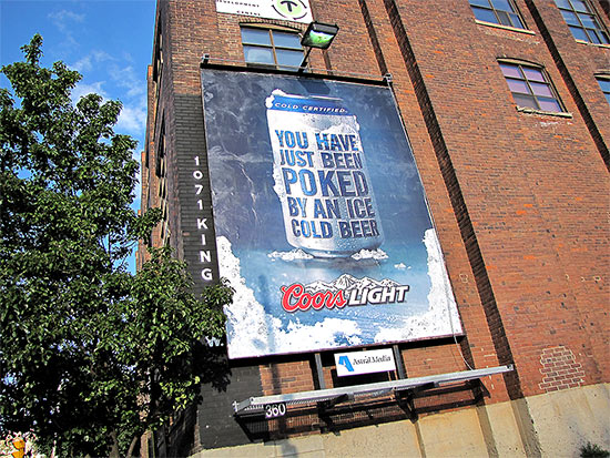
However, on my standard route this afternoon I found another one of their ads:

no ... YOU got poked! YOU GOT POKED!!

I read it. Then again. Then one more time.

I still don’t get it.

I mean, I like to think I’m kinda hip when it comes to this social media stuff. I may never have become a Facebook addict because I found it to be a cheap high, I never did have much use for MySpace because I already have my space, and while YouTube has been an endless source of painful (in so many ways!) hilarity, I can only digest it in twenty minutes sittings. But I digest (YES!! FINALLY GOT TO USE IT!!). I do it to stay with it. Like I said, hip. *thumbs up*

So this Coors ad … what the heck is it supposed to mean? Is it a reference to an online chat room where someone pokes you to get your attention? With a beer? I’m just not stoned enough to appreciate that, I guess.

My next thought was troubling; did someone just imply inserting a cold beer into my anus?! And what about the option for ladies?! — Hopefully that was not the message.

Could it be that someone has just physically poked you, with a beer? Does that make the beer more appealing in some way? Maybe has it touched a variety of sweaty spots during the poke and is now ringed with savoury body salts? Not with my beer, thank you kindly.

It just seems like the Coors people are having some trouble getting their message across. Look here:

no, just too early for christmas. sorry.

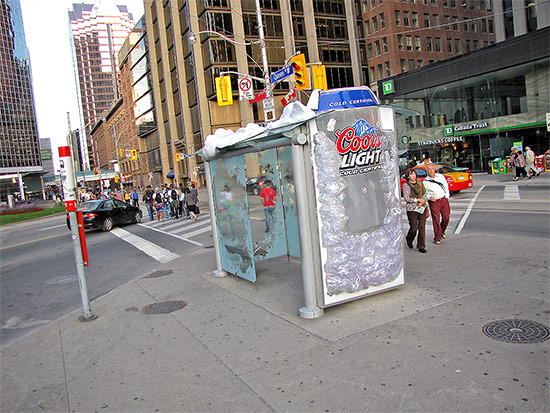
So what’s so bad about this? On the surface, nothing. You have a beer that’s so cold that it’s been frozen to the bus shelter. The whole thing has, in fact, become a giant ice box. The image of a super-cooled beverage was probably intended to convey how you’d just turn to a chunk of solid ice the moment that baby hit your lips – it’s that cold.

The first problem is that it’s a lie. A visual lie, I mean. You walk into that shelter on a sweltering day and it’s not a bit cooler than it is outside. In situations like that, the “ice” becomes “condensation” from the heat, trapping the sheltered travellers in a sweltering sauna! Or at least it seems that way.

The second problem is that it’s it’s such an extreme image, all I can think of is the pain of anything ice cold hitting the back of my throat on a hot day. Some people get brain freeze, I get this; either way, I don’t want anything that cold to drink. A voice box that can be shattered with the tap of a hammer is not refreshing to me, I don’t care how many calories it has.

Finally, you got the snow on top. That’s Toronto for a good chunk of the year; summer is when most people try to forget about it.

The message was supposed to be Coors: cold and refreshing, but to me it came across as Coors: deceptive, painful, and upsetting.

I don’t even have anything against Coors. Not a beer I care for but I’d give it a hand if it fell in the street. You know, live and let live sorta thing. Besides, other beer companies have subscribed to strange advertising ideas too. Take this Stella Artois ad, for example:

barely refreshing

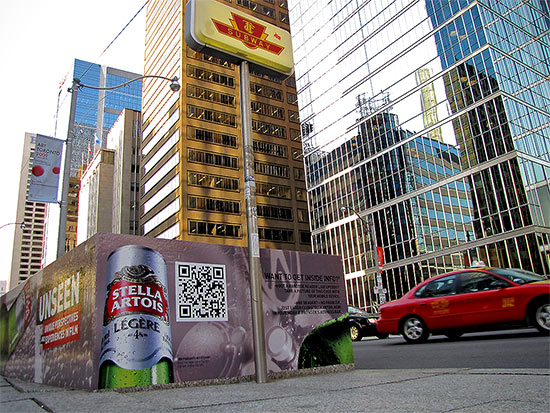
The weird square in the middle is an UpCode tag. What you’re supposed to do is to download the UpCode application to your mobile phone. When you run it, it uses your webcam (at a very low resolution) to scan the code in, like the UPC scanner at supermarkets, and it opens up the web page it reads in. An automatic, no-type web address, if you will.

If you’re bored, you can read the UpCode from the photo above (the large size works better) on your own phone; just tilt it a bit to flatten the square in your display.

Anyhow, the whole thing seems like a long diversion, doesn’t it? And what does it link to?

error in forward slash indeed!

Hopefully they’ve fixed it by the time you’re reading this, but you’d think they’d get their act together considering the poster is, like, out there.

They could’ve used that spot in the ad for a nice-looking model doing enticing things with a beer bottle. Instead, it sports an ill-conceived brick.

I believe in the modern interweb lingo, this is called advertising FAIL. (sorry, not sure if I’m supposed to italicize that)

At least Coors got the part about Torontonians being frigid jerks right.

yeah, hugs of hatred!

Filed under: B Sides, Pictures

Web pr0n

Posted on June 10th, 2009 Be the first to comment

I gotta be honest with you, when I finally spotted that big red ball, my hopes were about as deflated as it was. It was folded neatly in front of the cube van in an alley on Elm Street, thus dashing my vision of watching them rolling it up Yonge Street in rush-hour traffic.

So I decided to come home and do a bit of surfing through the local newspapers. I maintain that “surfing” is still used among webby people. As alternatives, we sometimes use “slacking” or “pr0n hounding”.

Anyway, most of it sounded absolutely dreadful. In fact, if it wasn’t for one thing that kept bugging me, I would’ve just flipped to Wipeout so as to at least try to quench my unfulfilled desire for a big red ball.

Because I’ve been whoring this site out quite a bit lately, I’ve noticed that I’ve started to become keenly aware of not only ad placement but also of content. For example, on almost all major news sites, there’s a banner above the main story and the “sweet spot” of advertising gold sitting in the site’s left armpit (your lower-right).

Please allow me to demonstrate:

small-cap-7

Here we have a heartwarming reminder about father’s day and a rather cheap looking credit score ad at the top. Usually these ads are placed here based on context or relevance to the article. At least, that’s the idea.

When I started to take more notice of these and the content they were connected to, it highlighted how open the market for contextual advertising still is. Monkeys, infants, and hamsters could all do an equally compelling job.

In the mess above, the computer responsible for deciding which ads go where concluded that a dead guard would probably remind you of your father. The mood called for a murderific Father’s Day gift, but not at the expense of your credit rating.

Here’s another interesting combination:

small-cap-1

At least the computer here was being pragmatic. You got old dead man, you gotta wash that old dead man stink out. And hang on to your hard-earned dough ’cause you could be next, sucker.

Pragmatic but awful!

And what about this?

small-cap-4

The computer may be trying to herd us out into the middle of the desert for something; get us all stinking drunk, no money, just sand and heat and scorching sun. That’s really the only connection I can see between murder and showing us where we should go to get away from it: Crime-free Nevada.

In case you need further evidence:

small-cap-3

We all know that the OLG is run by shifty robots so that doesn’t leave much place for the humans. And they’re being left to die and rot alone in the cities, not like the cramped but happy humans being transported to the Las Vegas processing facility.

Or…the computer that decided to put these ads here is just dumb. Maybe you’ll never look at web sites the same way again. Maybe if I didn’t spend so much time slacking or pr0n hounding, I’d think of something more interesting. Maybe some real content tomorrow. Maybe a big red ball.

Filed under: Pictures, Why I'm Right

Sweat problems, itchy crotches, and abrasive feet

Posted on May 21st, 2009 Be the first to comment

Last night at around ten o’clock I switched to CFMT (OMNI) to try to fill in a commercial break on the other channel with the Simpsons. I find the colours pleasantly distracting.

Unfortunately, they were also on an ad break, but one that made me want to stay and watch further.

It was composed of these strange little mini commercials that ran for only about ten seconds and featured relatively obscure products.

The first was for Perspirex, an industrial-strength antiperspirant,  “Available at Shoppers Drug Mart“. It features an attractively nondescript young lady in a green top out on a date with…? She reaches for a flirty lock of her hair through which to run her fingers when she spots a big ole’ pitter soaking her shirt. Smile of delight one instant, dropped jaw of disbelief the next.

Bam! Perspirex gets rid of that wetness and smell. Lady’s happy and she’s now letting the whole room get a good gander at her moisture-free underarms. Available at Shoppers Drug Mart.

Yep. If that sounded a bit awkward, imagine what the commercial was like.

Next one: “As a model, I can’t be seen with embarrassing bumps on my bikini line.” Swimsuit model at a photo shoot, at times strangely aware of the TV audience watching her. Shot of smooth crotch in frilly lingerie.

Bikini Zone Cream: Stop Bikini Area Irritation Fast

…more sundry crotch shots, all with nary an imperfection.

Like I said, these commercials are really short. There isn’t even enough time to write complete sentences to describe them.

Sudden cut to three ladies’ legs on a sidewalk, one wearing galoshes and the two flanking her in strappy heels. Seems the poor girl’s hiding her feet in them big old boots ‘cuz she has an issue with dry, cracked feet. Well, dontcha know that Flexitol Heel Balm will fix that right up!

Now our girl’s just disembarked from a city bus and she’s in heels, smiling and pointing to her attractive new foot, as we are all wont to do.

Well, now wasn’t that something?

They were clearly targeting the ladies. Every commerciallette featured women exclusively. One of the products, the bump creme, seemed particularly unsuitable for most men. I guess, also, the “bikini” part of the product seemed somewhat feminine.

Okay, so they want women to use these products; women who must have fairly extreme sweat problems, itchy crotches, and abrasive, possibly bleeding feet.

The ads are just too similar, short, and tightly cut. What should have been three ads became one perturbing ad targeting a clientele with some disturbing medical conditions. Alone, each symptom is trivial, but together…forget about dinner and lingerie modeling; get your ass to a doctor, pronto!

Or maybe I shouldn’t think that deeply into it.

Wait. Isn’t that what they did at the ad agency that created this TV spot?

Available at Shoppers Drug Mart.

Sponsored links:

natural skincare

Filed under: B Sides