Posts Tagged ‘ advertising ’

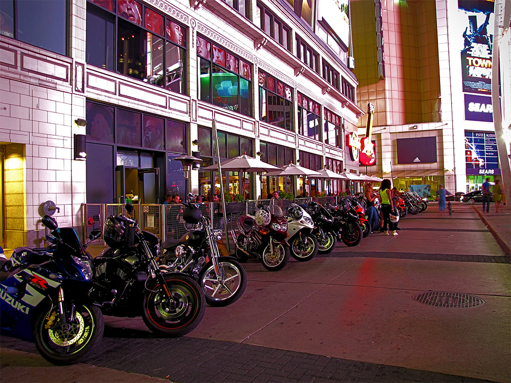
Ascent
Posted on March 15th, 2017 – Comments Off on Ascent
Solidarity (not unity)
Posted on March 7th, 2016 – Comments Off on Solidarity (not unity)
Yonge Views
Posted on February 22nd, 2016 – Comments Off on Yonge Views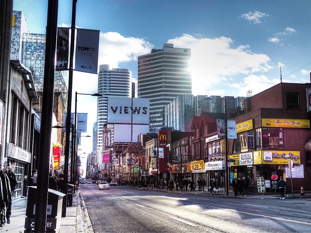
Skinworks
Posted on July 16th, 2014 – Comments Off on Skinworks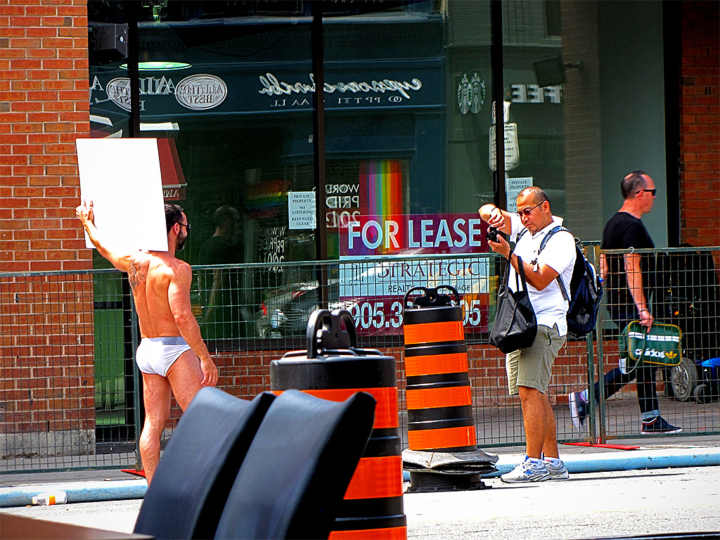
Racy street advertising for Steamworks, Church Street
What happens at night, stays at night
Posted on August 31st, 2010 – 4 CommentsBetween the vagaries of my web development work and daily life — “minor” updates to glade.ca that turned so easily into a complete three-week site overhaul, that challenging Levi’s “Go Forth” campaign, endless TD Canada Trust banners, assorted Purolator stuff, birthdays, and a visit to Canada’s Wonderland (Behemoth is pretty kick-ass, I must say ), I’ve hardly had room to swing a cat through my schedule.
Just as well – Ollie probably wouldn’t have taken well to it.
I finally managed to convince one of the agencies I work with that the term “independent contractor” isn’t merely a figure of speech (that and the liberal use of the term “employee” – why do I keep running into this?!), so I was looking forward to doing some work from home and mixing in healthy doses of blogging. But fate, being the filthy whore she is, pulled another steamy week out of her ass.
That window fan I’ve had going non-stop for about three months now has simply been circulating oven-like heat throughout my living room, over the exposed chassis of my computer and two surprisingly warm monitors (programming with just one monitor is a sort of punishment), and right back at my puffy, bloated face. Oh yeah, and it’s allergy season again.
Anyhow, I finally ran out of excuses tonight and took it to the streets.
Quality condomes
Posted on August 19th, 2010 – Comments Off on Quality condomesWith much gracious thanks to new income via new clients (one of whom may be reading this very post – Hi, S!), I’ve once again been able to get into the habit of a leisurely Saturday morning breakfast at the local greasy spoon; sunny, bacon, brown with an orange juice starter. The staff had that shit memorized a year ago, that’s how regular I am. And regular I once again am, the grease sees to that. Yeah, you know what that not-so-subtle word play is getting at.
So I’m terribly pleased to be back to be back to my regular Saturday routine, breakfast, coffee, and extracted sections of the voluminous Saturday Star: the news section, Insight, Weekend Living, and the stalwart comics. If someone were to finally remove the creator of the Family Circus blight, I’d be tempted to call it perfection.
Well, that and a few other unsightly blemishes I’ve noted inside the main news section, namely the condo ads.
Now, to be fair, I’m on record as saying that all the new development around Toronto is a good thing, and I stand by that. Even if some of the architecture is a little uninspired, the corollary benefits are great: lots of competition means lower prices, denser population means less destruction of green space, and being closer to where the action is can effectively remove the need for a car. I gave mine up two years ago and haven’t looked back – surprisingly hard to do without a rear-view mirror.
But the ads for these new condos, they’re just a bit on the weak side. Maybe it’s because I’m such an instantly critical jerkhole, but I immediately read between the lines, often without reading the lines themselves.
Take this ad for FIVE Condos, located at 5 Saint Joseph Street, not terribly far from my own groovy pad:

The regrettable, dark, and backwards month
Posted on November 3rd, 2009 – 8 CommentsNovember is so far proving to be a regrettable, dark, backwards, yet strangely forward-looking month. It even produces clumsy opening sentences!
To begin with, I completely missed Halloween. My hemorrhagic fever (I cut myself shaving) not only cost me my opportunity for cheap chocolate, but I didn’t even get to see my brobro’s costume. I asked my younger sis to send me a pic but that may or may not come to pass. May lady Fate smile on us.
Next came that Daylight Saving Time fiasco.
Today when I stepped out for a much-needed haircut, I was met with stark darkness:

I thought the entire point of D.S.T. was to save our daylight hours, not destroy them completely! Thanks a lot, Mr. Hudson. (shifty Kiwi, of course!)
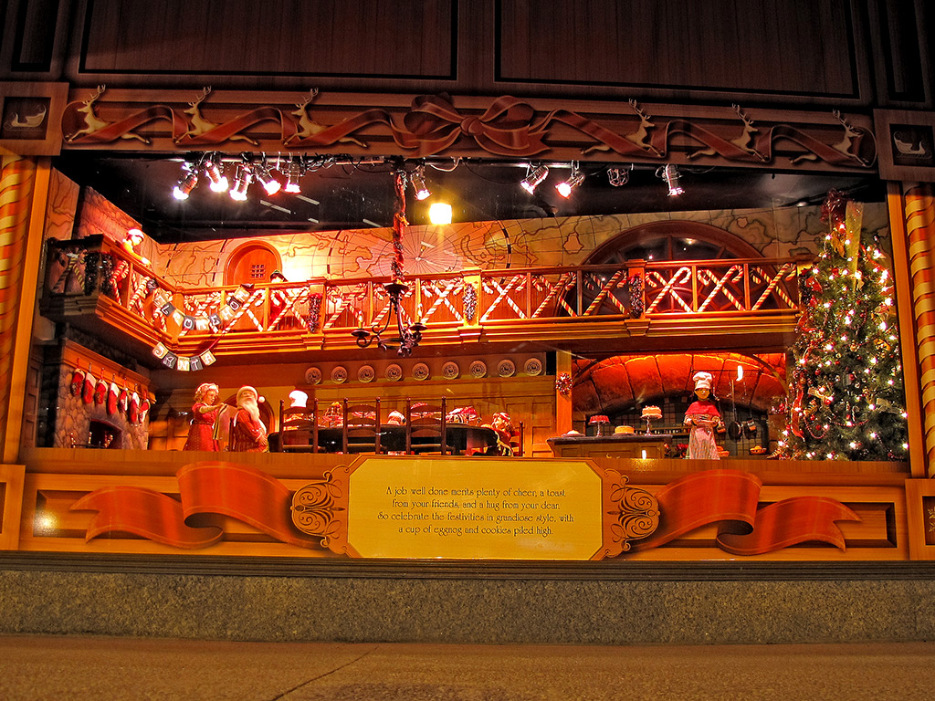
And now, with the half-price Halloween candies still hanging around on shelves, all manner of Christmas gaudiness is blasting everyone in the face. Don’t we still have Rememberance Day? And what about U.S. Thanksgiving? I mean, it’s in the wrong month, but I say live and let eat turkey. Where’s the harm? Why you gotta get people all worked up and credit cardy?
I know, I know; it’s nothing new, but it still manages to somehow surprise me every year. This year the shock was somewhat mitigated by the general classiness that some retailers chose to adopt. For example, the Hudson’s Bay Company (no relation), chose to forgo the neon, abstract, tree-like constructs they’ve been sporting since the eighties in favour of more classic window displays:
Home of the frigid jerk
Posted on August 31st, 2009 – 9 CommentsA couple of weeks ago, a few Torontonians got all sorts of feminine undergarments bunched up in their crevices when they learned that Coors had mentioned Toronto in one of their ads in B.C. “Colder than most people from Toronto”, was the exact phrase.
I wouldn’t have even mentioned it because the whole thing barely warranted it. What, like thirty to forty people complained? TCL gets that many visitors in a month, easy!
However, on my standard route this afternoon I found another one of their ads:

I read it. Then again. Then one more time.
I still don’t get it.
I mean, I like to think I’m kinda hip when it comes to this social media stuff. I may never have become a Facebook addict because I found it to be a cheap high, I never did have much use for MySpace because I already have my space, and while YouTube has been an endless source of painful (in so many ways!) hilarity, I can only digest it in twenty minutes sittings. But I digest (YES!! FINALLY GOT TO USE IT!!). I do it to stay with it. Like I said, hip. *thumbs up*
So this Coors ad … what the heck is it supposed to mean? Is it a reference to an online chat room where someone pokes you to get your attention? With a beer? I’m just not stoned enough to appreciate that, I guess.
My next thought was troubling; did someone just imply inserting a cold beer into my anus?! And what about the option for ladies?! — Hopefully that was not the message.
Could it be that someone has just physically poked you, with a beer? Does that make the beer more appealing in some way? Maybe has it touched a variety of sweaty spots during the poke and is now ringed with savoury body salts? Not with my beer, thank you kindly.
It just seems like the Coors people are having some trouble getting their message across. Look here:

So what’s so bad about this? On the surface, nothing. You have a beer that’s so cold that it’s been frozen to the bus shelter. The whole thing has, in fact, become a giant ice box. The image of a super-cooled beverage was probably intended to convey how you’d just turn to a chunk of solid ice the moment that baby hit your lips – it’s that cold.
The first problem is that it’s a lie. A visual lie, I mean. You walk into that shelter on a sweltering day and it’s not a bit cooler than it is outside. In situations like that, the “ice” becomes “condensation” from the heat, trapping the sheltered travellers in a sweltering sauna! Or at least it seems that way.
The second problem is that it’s it’s such an extreme image, all I can think of is the pain of anything ice cold hitting the back of my throat on a hot day. Some people get brain freeze, I get this; either way, I don’t want anything that cold to drink. A voice box that can be shattered with the tap of a hammer is not refreshing to me, I don’t care how many calories it has.
Finally, you got the snow on top. That’s Toronto for a good chunk of the year; summer is when most people try to forget about it.
The message was supposed to be Coors: cold and refreshing, but to me it came across as Coors: deceptive, painful, and upsetting.
I don’t even have anything against Coors. Not a beer I care for but I’d give it a hand if it fell in the street. You know, live and let live sorta thing. Besides, other beer companies have subscribed to strange advertising ideas too. Take this Stella Artois ad, for example:

The weird square in the middle is an UpCode tag. What you’re supposed to do is to download the UpCode application to your mobile phone. When you run it, it uses your webcam (at a very low resolution) to scan the code in, like the UPC scanner at supermarkets, and it opens up the web page it reads in. An automatic, no-type web address, if you will.
If you’re bored, you can read the UpCode from the photo above (the large size works better) on your own phone; just tilt it a bit to flatten the square in your display.
Anyhow, the whole thing seems like a long diversion, doesn’t it? And what does it link to?

Hopefully they’ve fixed it by the time you’re reading this, but you’d think they’d get their act together considering the poster is, like, out there.
They could’ve used that spot in the ad for a nice-looking model doing enticing things with a beer bottle. Instead, it sports an ill-conceived brick.
I believe in the modern interweb lingo, this is called advertising FAIL. (sorry, not sure if I’m supposed to italicize that)
At least Coors got the part about Torontonians being frigid jerks right.

Web pr0n
Posted on June 10th, 2009 – Comments Off on Web pr0nI gotta be honest with you, when I finally spotted that big red ball, my hopes were about as deflated as it was. It was folded neatly in front of the cube van in an alley on Elm Street, thus dashing my vision of watching them rolling it up Yonge Street in rush-hour traffic.
So I decided to come home and do a bit of surfing through the local newspapers. I maintain that “surfing” is still used among webby people. As alternatives, we sometimes use “slacking” or “pr0n hounding”.
Anyway, most of it sounded absolutely dreadful. In fact, if it wasn’t for one thing that kept bugging me, I would’ve just flipped to Wipeout so as to at least try to quench my unfulfilled desire for a big red ball.
Because I’ve been whoring this site out quite a bit lately, I’ve noticed that I’ve started to become keenly aware of not only ad placement but also of content. For example, on almost all major news sites, there’s a banner above the main story and the “sweet spot” of advertising gold sitting in the site’s left armpit (your lower-right).
Please allow me to demonstrate:

Here we have a heartwarming reminder about father’s day and a rather cheap looking credit score ad at the top. Usually these ads are placed here based on context or relevance to the article. At least, that’s the idea.
When I started to take more notice of these and the content they were connected to, it highlighted how open the market for contextual advertising still is. Monkeys, infants, and hamsters could all do an equally compelling job.
In the mess above, the computer responsible for deciding which ads go where concluded that a dead guard would probably remind you of your father. The mood called for a murderific Father’s Day gift, but not at the expense of your credit rating.
Here’s another interesting combination:

At least the computer here was being pragmatic. You got old dead man, you gotta wash that old dead man stink out. And hang on to your hard-earned dough ’cause you could be next, sucker.
Pragmatic but awful!
And what about this?

The computer may be trying to herd us out into the middle of the desert for something; get us all stinking drunk, no money, just sand and heat and scorching sun. That’s really the only connection I can see between murder and showing us where we should go to get away from it: Crime-free Nevada.
In case you need further evidence:

We all know that the OLG is run by shifty robots so that doesn’t leave much place for the humans. And they’re being left to die and rot alone in the cities, not like the cramped but happy humans being transported to the Las Vegas processing facility.
Or…the computer that decided to put these ads here is just dumb. Maybe you’ll never look at web sites the same way again. Maybe if I didn’t spend so much time slacking or pr0n hounding, I’d think of something more interesting. Maybe some real content tomorrow. Maybe a big red ball.